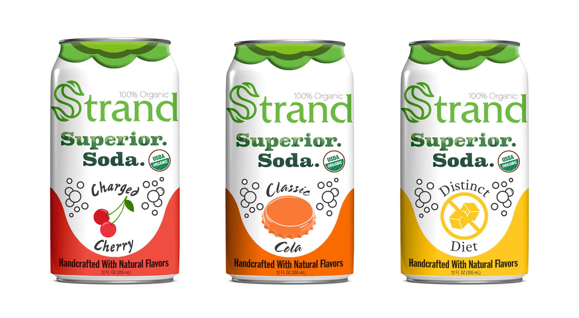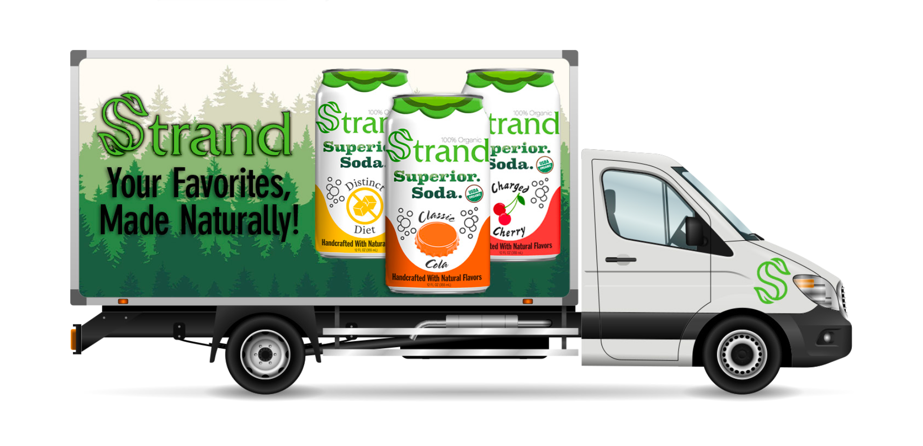
I was tasked with revamping the brand identity, as well as designing the logo for a fictional soda brand. I wanted to challenge myself by choosing “Strand Superior Soda” because the client required that I create a series of three renders for each of their flavors. They also requested that I emphasize the organic ingredients. I wanted the colors to be bright and bold so that they would stand out against the simple white background. I put the “Superior Soda” in bold text to make it a statement, and I put trees in the text to give it an Artisinal feel. Since their target demographic are those who are concerned about health, I made sure to make the USDA logo prominent in the composition. As for the green leaf at the top of the can, the idea was that it would be three-dimensional, protruding from the can, so that the product will stand out from the competition.